Light vs Dark Themes in Power Apps: Why Theme Flexibility Improves UX
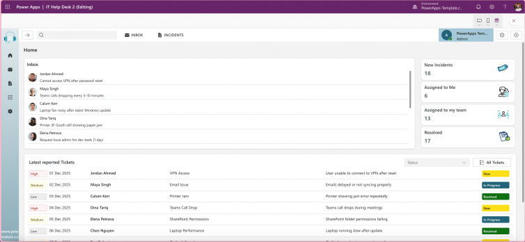
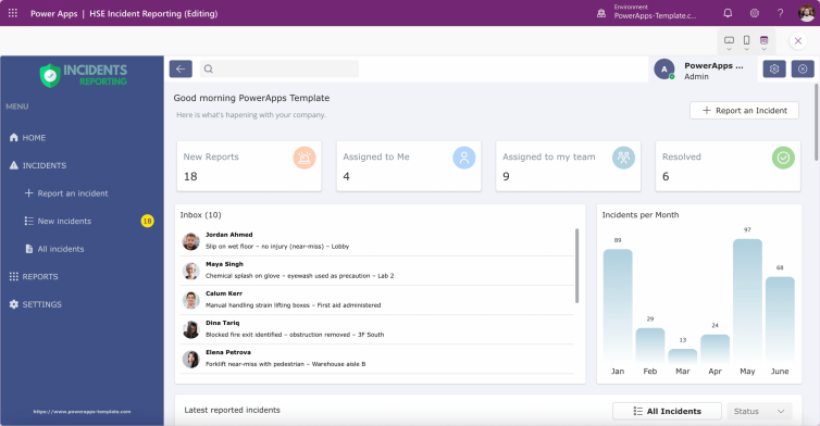
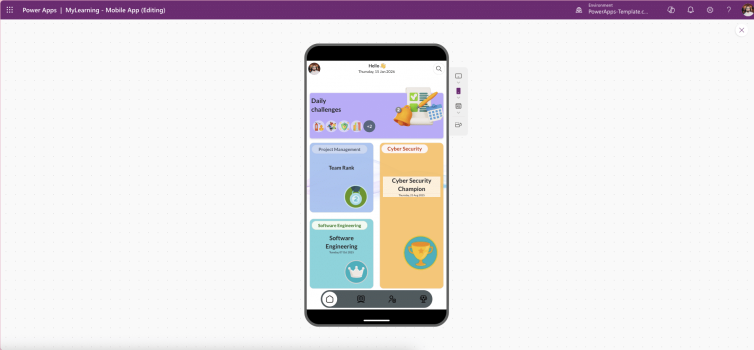
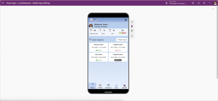
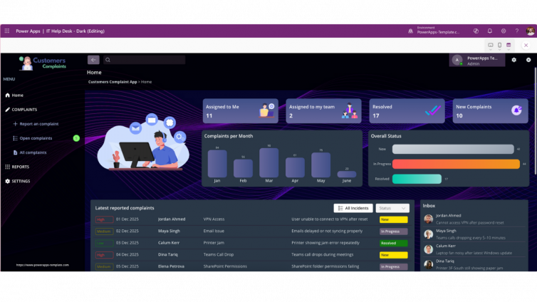
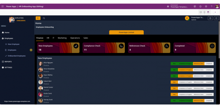
Light and dark themes have become essential in modern app design, especially in Power Apps and low-code platforms. Providing users with theme flexibility improves comfort, accessibility, and engagement, while also ensuring your app looks professional across all devices.
1. Comfort and Accessibility
- Reduce Eye Strain: Dark themes help users working in low-light environments, while light themes remain ideal for bright settings.
- Inclusive Design: Some users with visual sensitivities prefer one mode over the other. Giving options ensures everyone feels accommodated.
2. Personalisation Builds Engagement
Modern users expect control. Allowing theme switching makes your app feel professional and user-centric, aligning with Microsoft’s design principles for better adoption.
3. Brand Consistency Across Modes
Themes should maintain your brand identity—colours, typography, and contrast ratios—whether in light or dark mode. This ensures a polished, consistent experience.
4. Technical Best Practices
- Use theme variables in Power Apps for dynamic colour changes.
- Follow WCAG 2.1 contrast guidelines for accessibility.
- Test both modes thoroughly to avoid broken layouts.
5. Why It Matters for Low-Code
Low-code platforms accelerate development, but skipping theme flexibility can make apps feel incomplete. Adding light and dark modes is a small effort with a big impact on UX.
Conclusion: Light and dark themes aren’t a trend they’re a standard for modern app design. Implementing them in Power Apps shows attention to detail and commitment to user experience.