

Power Apps Sales & Reporting Dashboards: Templates That Replace the Spreadsheet
KPIs, charts and live data in one Power Apps dashboard. See what a sales reporting template should include, and what's already built.
Sales and operations reporting has a familiar failure mode: a spreadsheet that starts clean, gets a new tab every quarter, and eventually needs someone senior to interpret it before a meeting. A Power Apps dashboard template solves the same problem a BI tool does, at a fraction of the setup time, if the underlying structure is right.

In this guide
What a reporting dashboard actually needs
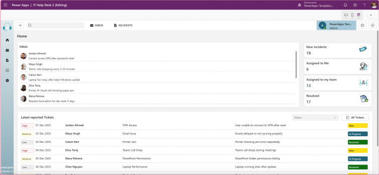
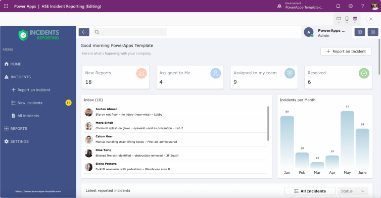
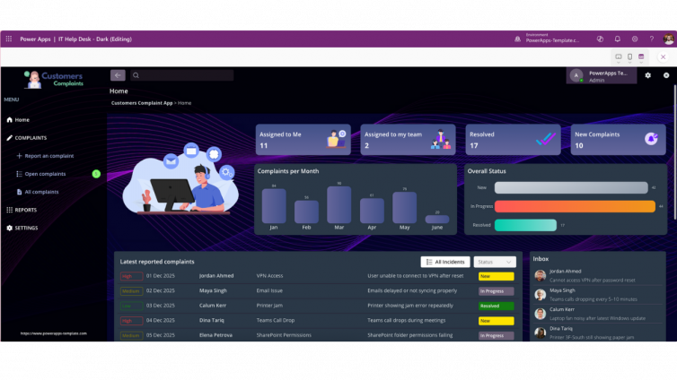
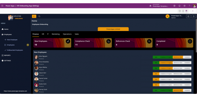
- 1 Pre-built KPI and chart sections Ready sections for cards, charts and KPIs, not a blank canvas you fill in from scratch every time a new metric matters.
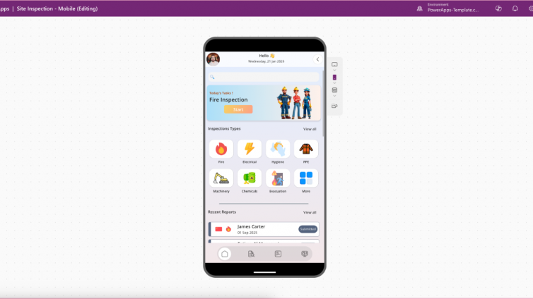
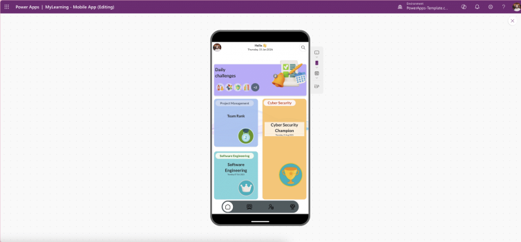
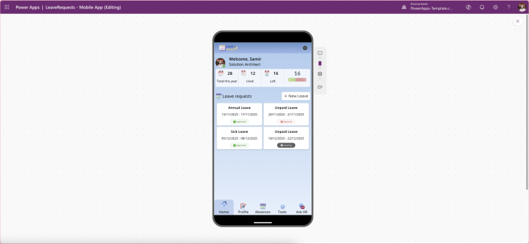
- 2 A layout that holds up across devices Desktop for the deep dive, tablet for the standup, mobile for checking a number between meetings. All the same dashboard.
- 3 Live data integration Connected to SharePoint, Dataverse, Excel or an API, not a static export that's already stale by the next standup.
- 4 Branding flexibility Colours, fonts and layout that match your business, not a generic dashboard skin that reads as a demo.
Where this fits your catalog
Zales App Template
$99Pre-built sections for cards, charts and KPIs, in a responsive layout that works the same on desktop, tablet and mobile. Connects to SharePoint, Dataverse, Excel or an API, and is fully customisable to match your branding and data sources. Replaces the spreadsheet-to-slide workflow most sales and ops teams are still stuck in.
View template and pricingWhy live data matters more than the visuals
A dashboard that looks polished but pulls from a static export is a slower version of the spreadsheet problem, just with better colours. The real value is in connecting to live data so the numbers in the meeting match the numbers in the system, not last Tuesday's copy-paste. That's the difference between a report and a snapshot that's already out of date by the time someone screenshots it for a slide.
FAQ
Can Power Apps replace Power BI for reporting?
For lightweight, operational dashboards embedded inside a workflow app, yes. For deep analytical reporting across large datasets, Power BI is still the stronger tool, the two are often used together.
What should a Power Apps sales dashboard include?
KPI cards, chart visualisations, live data connections, and a responsive layout that works the same on a phone as it does on a desktop monitor.
Can a Power Apps dashboard connect to multiple data sources?
Yes, a well-built dashboard template can pull from SharePoint, Dataverse, Excel or an API, so you're not limited to a single system of record.
The bottom line
The spreadsheet-to-slide cycle isn't a reporting problem, it's a structure problem. A dashboard built with live connections and a responsive layout from the start replaces that entire cycle with something that's always current, on whatever device someone opens it on.
Replace the spreadsheet with a live dashboard
The Zales App Template ships as a full unmanaged solution, ready to connect to your data and customise to your branding.
View the Zales App Template