UI/UX in Microsoft Power Apps: Why Design Determines Success in Low-Code Projects
Great functionality alone does not guarantee success in Power Apps or low-code projects. Without strong UI (User Interface) and UX (User Experience), even the most powerful applications suffer from poor adoption, low engagement, and high support costs.
In 2026, UI/UX is no longer a “design layer” added at the end it is a core success factor. Well-designed Power Apps are easier to use, more accessible, faster to adopt, and more aligned with business goals. This article explains why UI/UX matters in Power Apps, Microsoft’s design principles, and how teams can deliver high-quality experiences faster using ready-made templates.
The Role of UI/UX in Low-Code Development
Low-code platforms democratise app development by allowing business users and developers to build solutions rapidly. However, speed without design discipline introduces risk.
According to Microsoft’s low-code guidance, usability and consistency are critical to ensure that apps built quickly are also usable, scalable, and accessible. This principle is reinforced across official documentation from Microsoft Learn.
Without UI/UX fundamentals:
-
Navigation becomes unclear
-
Interfaces feel inconsistent
-
Accessibility requirements are missed
-
Users abandon apps even if they technically work
Good UI/UX bridges the gap between functionality and usability, ensuring apps feel intuitive and professional rather than experimental.
Why UI/UX Is Crucial for Power Apps in 2026
Power Apps provides a flexible canvas, but its default UI is intentionally minimal. Microsoft expects makers to apply design systems, layout logic, and accessibility standards to deliver enterprise-grade experiences.
Strong UI/UX in Power Apps delivers measurable value:
-
Higher Adoption Rates: Clean layouts reduce cognitive load and training needs
-
Improved Accessibility: Inclusive design supports diverse users and compliance
-
Brand Consistency: Custom themes and components reflect organisational identity
-
Operational Efficiency: Intuitive navigation speeds up task completion
Google’s 2026 ranking systems increasingly reward user satisfaction signals, making UI/UX-driven content and products more visible in search especially for SaaS, templates, and low-code solutions.
Microsoft-Recommended UI/UX Best Practices for Power Apps
Microsoft’s App Design Checklist and Power Platform guidance highlight several core principles:
1. Consistency
-
Unified fonts, colours, spacing, and control behaviour
-
Reusable components instead of one-off designs
2. Responsive Design
-
Layouts that adapt across mobile, tablet, and desktop
-
Containers instead of fixed positioning
3. Simplicity
-
Minimal steps to complete key tasks
-
Clear call-to-action buttons
-
Logical screen flow
4. Accessibility
-
Proper contrast ratios
-
Keyboard navigation support
-
Screen-reader-friendly labels
These principles are foundational to building professional Power Apps that scale across teams and devices.
Risks of Ignoring UI/UX in Low-Code Projects
Neglecting UI/UX introduces long-term costs that often outweigh the initial speed benefits of low-code development:
-
Apps become cluttered and confusing
-
User adoption drops sharply
-
Support tickets increase
-
Training and documentation overhead grows
As industry practitioners consistently note, a low-code app that works technically but fails to resonate with users will be underutilised, limiting ROI and stakeholder confidence.
Real-World Impact of Strong UI/UX in Power Apps
Independent research validates the business case for well-designed low-code solutions.
A Microsoft-commissioned study by Forrester found:
-
188% ROI over three years from Power Apps adoption
-
74% reduction in development costs using low-code platforms
However, these gains depend heavily on user adoption, which is directly influenced by UI/UX quality. Apps that are intuitive, accessible, and visually coherent consistently outperform poorly designed alternatives.
Practical UI/UX Tips for Power Apps Teams
To improve UI/UX outcomes:
-
Use Fluent UI components for consistency with Microsoft products
-
Design layouts in Figma or Adobe XD before building
-
Apply responsive design patterns for multi-device usage
-
Keep navigation shallow and predictable
-
Use templates to avoid reinventing proven design patterns
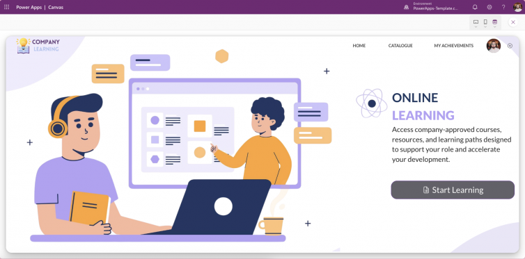
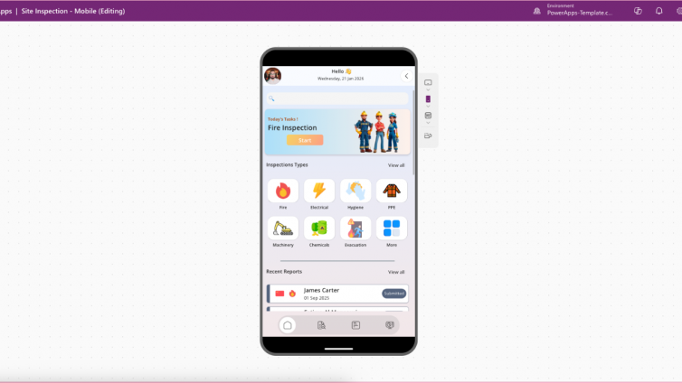
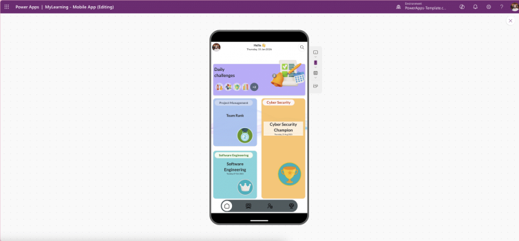
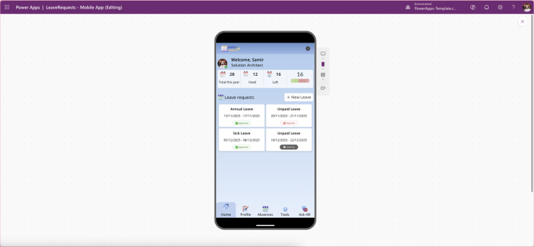
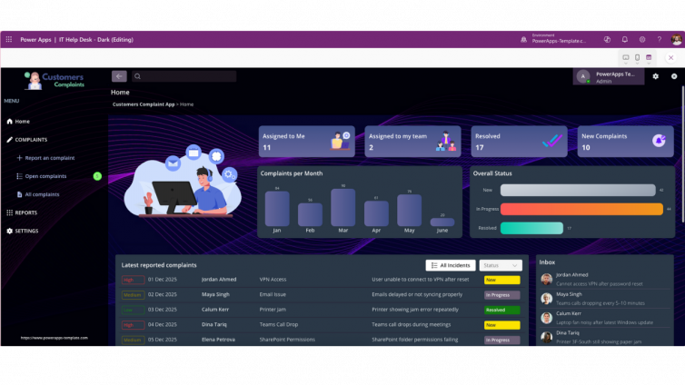
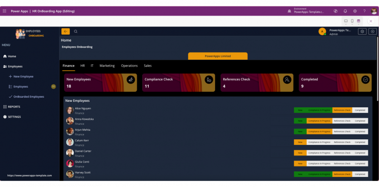
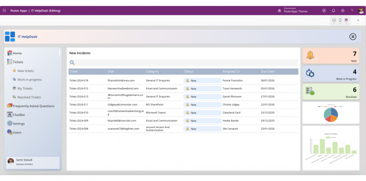
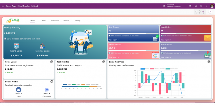
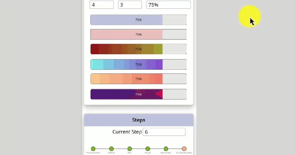
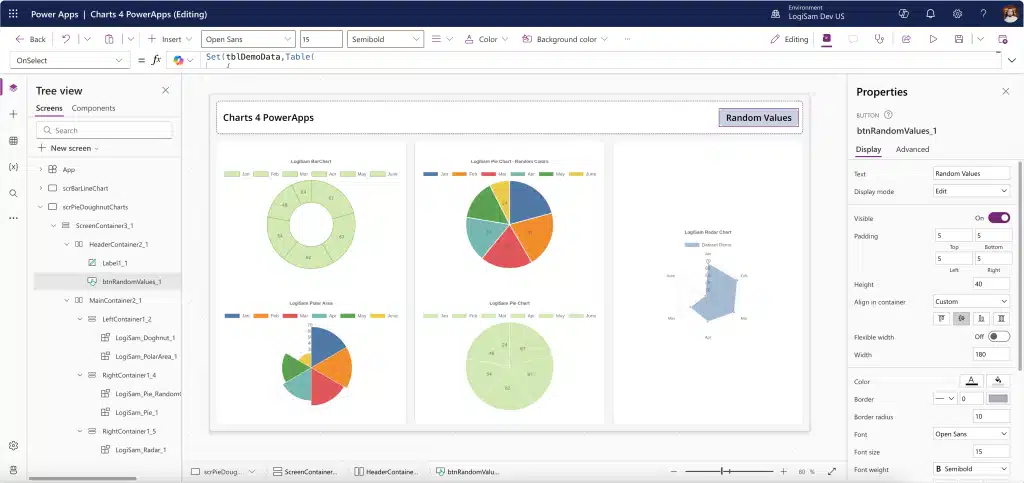
👉 Explore our professionally designed Power Apps templates to accelerate delivery while ensuring best-practice UI/UX, responsiveness, and accessibility from day one.
Conclusion: UI/UX Is the Difference Between Adoption and Abandonment
Low-code accelerates development but UI/UX determines success. In Power Apps projects, design quality directly impacts usability, adoption, accessibility, and ROI.
By investing in UI/UX principles—or leveraging ready-made Power Apps templates—you ensure your apps are not just functional, but intuitive, scalable, and aligned with real user needs.
