Power Apps Progress Bars & Step Bars: Simple UI Components That Transform User Experience
Great user experience in Canvas Apps is not only about visual design it is about guiding users clearly through a process. When users understand where they are, what comes next, and how much effort remains, completion rates increase and frustration drops.
Progress Bars and Step Bars are lightweight UI components that dramatically improve usability in Microsoft PowerApps. They bring structure, clarity, and professionalism to workflows such as onboarding, approvals, inspections, and multi-step forms without adding complexity.
Why Progress Bars Matter in Power Apps
Progress Bars provide continuous visual feedback, helping users understand how far they have progressed and what remains. In task-driven applications, this clarity is critical for user confidence and completion.
Key Advantages of Progress Bars
Clear Feedback
Users always know their current position within a process.Dynamic and Data-Driven
Progress can be tied to real-time values, flags, percentages, or completed steps.Highly Customisable
Adjust colours, size, animation, and light/dark themes to match branding.Mobile-Friendly by Design
Smooth performance across phones, tablets, and desktops.
Progress Bars are ideal for:
Multi-step forms
Approval workflows
Inspections and audits
Onboarding sequences
They reduce uncertainty and keep users engaged until completion.
Where Step Bars Shine
Step Bars focus on structure and orientation rather than percentage completion. They visually break a process into named stages, such as:
Details → Documents → Review → Submit
This approach is especially effective when each stage represents a meaningful milestone.
Why Step Bars Are So Effective
Instant Context
Users can see all stages at a glance.Optional Navigation
Steps can be clickable, allowing controlled back-and-forth movement.Ideal for Guided Experiences
Perfect for wizards, onboarding flows, training journeys, and inspections.Reusable Components
Built once, used consistently across multiple apps and screens.
Step Bars create predictable, structured flows that users intuitively understand.
Common Use Cases for Progress & Step Bars
These components significantly improve clarity and completion rates in:
Employee and customer onboarding
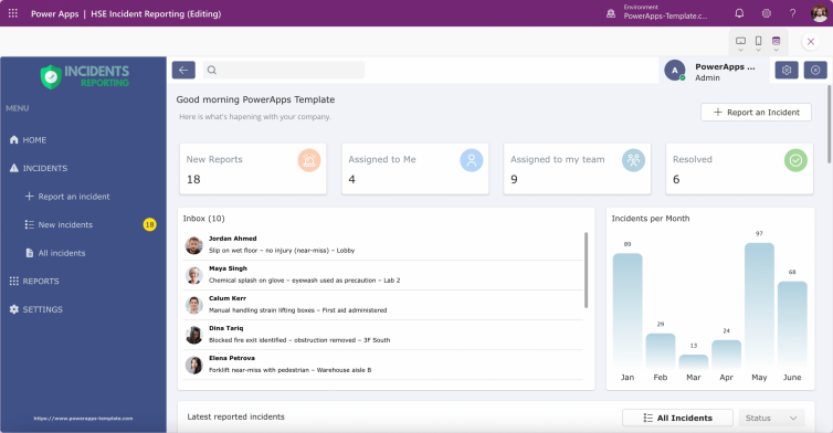
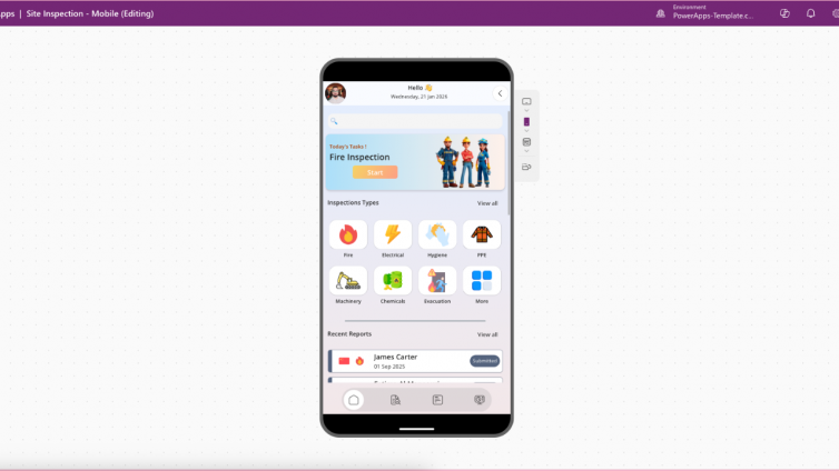
Site inspections and incident reporting
Multi-screen forms and data capture wizards
HR, finance, and compliance workflows
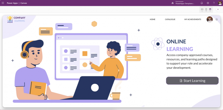
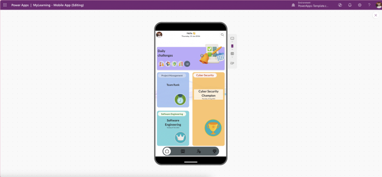
Training, certification, and learning journeys
By visually guiding users, apps feel simpler, faster, and more trustworthy.
Why These Components Improve Adoption and Completion Rates
In low-code environments, users abandon apps not because features are missing but because workflows feel confusing.
Progress Bars and Step Bars:
Reduce cognitive load
Set clear expectations
Encourage task completion
Improve perceived app quality
They turn complex processes into guided, manageable experiences.
👉 Explore Progress Bar and Step Bar components in our Power Apps shop to standardise UX, accelerate development, and deliver more intuitive Canvas Apps.
Final Thoughts: Small Components, Massive UX Impact
Progress Bars and Step Bars are simple, reusable UI components but their impact on user experience is significant.
They:
Reduce friction
Increase completion rates
Improve clarity
Make apps look polished and professional
If your Power Apps include any form of multi-step process, these components should be part of your standard UX toolkit.
