How to Build a Horizontal Gallery in Power Apps – Free Download
Create a sleek horizontal carousel gallery in Power Apps using Modern controls. This free component lets you bind images, titles and descriptions from a collection, navigate with left/right arrows, and track position with a built-in progress bar. Drop it into any Canvas App and reuse it across projects.

What Is a Horizontal Gallery in Power Apps?
A horizontal gallery displays items side by side in a scrollable row rather than the default vertical list. It works like the carousels you see on websites and mobile apps, where users swipe or click through content cards one at a time.
In Power Apps, the standard gallery control supports a horizontal layout out of the box, but it lacks the polished carousel behaviour most makers need. There are no built-in navigation arrows, no progress indicator, and no smooth card-to-card transition. To get that website-quality experience, you either have to build it from scratch with containers, timers and variables, or use a ready-made component like this one.
This horizontal gallery component solves that gap. It is built entirely with Modern controls, requires no PCF components or custom code, and works in any Canvas App, whether you are building for desktop or mobile.
Common scenarios where a horizontal gallery fits naturally include product catalogues, image portfolios, onboarding walkthroughs, team member spotlights, news feeds, and any screen where you want to present a curated set of cards without taking up the full page height.
Features of This Horizontal Carousel Component
This component ships as a reusable Canvas App element you can import into any project. Here is what it includes:
- Collection-bound data source. Feed your own collection of images, titles and descriptions. No hardcoded content. Update the collection and the carousel updates automatically.
- Left and right navigation arrows. Users click or tap arrows to move between items. The arrows disable at the start and end of the collection so users always know where they are.
- Built-in progress bar. A visual indicator at the bottom of the carousel shows how far through the item set the user has scrolled. It updates dynamically with each navigation action.
- Modern controls only. The entire component uses out-of-the-box Modern controls available in Power Apps. No PCF, no custom connectors, no external dependencies.
- Responsive card layout. Each card displays an image, a title and a description in a clean, structured layout that adapts to your app’s dimensions.
- Reusable design. Import the component once and drop it onto any screen in any project. Pass in your collection and it works immediately.
How to Set Up the Horizontal Gallery
Getting the component running in your app takes just a few steps. Download the free component using the form below, then follow this guide.
Step 1: Add the Component to Your Canvas App
Open your Canvas App in Power Apps Studio. Go to the Components section in the left panel and select Import Component. Upload the downloaded .msapp or component file. Once imported, the horizontal gallery component appears in your component library. Drag it onto any screen where you want the carousel to appear. Resize and position it to fit your layout.
Step 2: Bind Your Collection (Images, Titles and Descriptions)
The component expects a collection with three fields: an image URL or image reference, a title string and a description string. Set up your collection in the screen’s OnVisible property using ClearCollect. For example:
ClearCollect( carouselItems, { Image: "https://your-image-url.com/image1.png", Title: "First Item", Description: "A short description of the first item." }, { Image: "https://your-image-url.com/image2.png", Title: "Second Item", Description: "A short description of the second item." }, { Image: "https://your-image-url.com/image3.png", Title: "Third Item", Description: "A short description of the third item." }
)
Point the component’s Items property to your collection name. The carousel will render each record as a separate card.
Step 3: Configure Navigation Arrows
The left and right arrow icons are pre-wired inside the component. They use a context variable to track the current item index and increment or decrement it on each click. You can customise the arrow icons, colours and size by editing the component’s internal properties. The arrows automatically disable when the user reaches the first or last item, preventing out-of-bounds navigation.
Step 4: Add the Progress Bar
The progress bar is included by default. It calculates its fill width based on the current item index divided by the total number of items in the collection. As users navigate forward or backward, the bar updates in real time. You can adjust the bar’s colour, height and corner radius to match your app’s branding by editing the component properties.
Use Cases
A horizontal gallery is a versatile UI pattern. Here are some practical ways to use this component in your Canvas Apps:
Product showcases. Display product images, names and short descriptions for internal catalogues, sales tools or inventory apps. Users browse through items without leaving the screen.
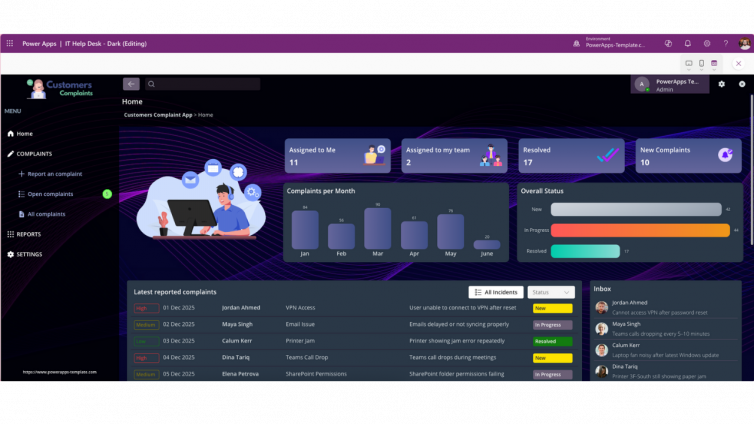
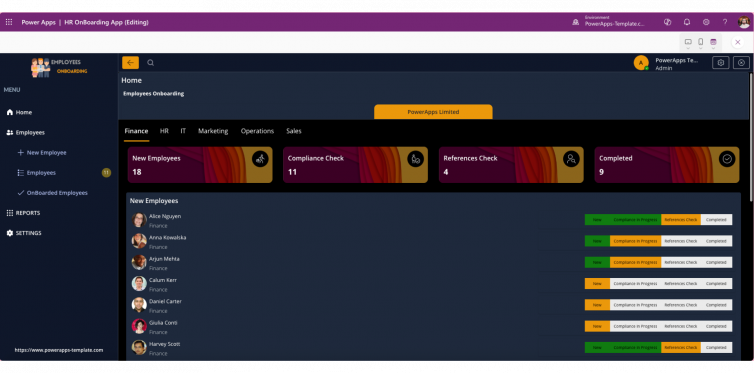
Employee onboarding. Create a guided walkthrough for new hires. Each card can present a step in the onboarding process with an image, a title and brief instructions.
News and announcements. Surface the latest company updates, blog posts or event highlights in a compact carousel on a home screen or dashboard.
Portfolio and project highlights. Showcase completed projects, case studies or design work with a visual-first layout that keeps the interface clean.
Featured content. Highlight selected templates, resources or featured items at the top of a landing screen, similar to how e-commerce sites promote top picks.