Responsive Design in PowerApps: Why Building for Every Device Matters in 2026
Responsive design is no longer optional for Power Apps it is a core requirement for usability, adoption, accessibility, and long-term scalability. In a mobile-first, multi-device world, users expect Power Apps to perform seamlessly across phones, tablets, laptops, desktops, and ultra-wide monitors.
If your app does not adapt intelligently to different screen sizes and orientations, you risk low adoption, poor user satisfaction, and higher redevelopment costs. This guide explains what responsive design means in Power Apps, why Microsoft prioritises it, and how you can implement best practices—faster—using ready-made Power Apps templates.
What Is Responsive Design in Power Apps?
Responsive design in Power Apps ensures that a single app dynamically adapts to different screen sizes, resolutions, and orientations. Instead of building separate mobile and desktop versions, responsive apps automatically adjust:
-
Layout structure
-
Control spacing and alignment
-
Font scaling
-
Visibility of non-essential elements
Microsoft defines responsive design as a core usability principle for modern low-code apps, enabling consistent experiences regardless of device type. Official guidance is documented in Microsoft Learn.
Why Responsive Design Is Critical for Power Apps in 2026
Power Apps are increasingly used for:
-
Field operations
-
Executive dashboards
-
Approval workflows
-
Customer-facing portals
These scenarios demand cross-device continuity. A user might start a task on mobile, continue on tablet, and finish on desktop.
Key Benefits
-
Improved User Experience: No zooming, scrolling, or broken layouts
-
Higher Adoption Rates: Users engage more with apps that feel native on every device
-
Accessibility Compliance: Supports inclusive design standards
-
Future-Proof Architecture: New screen sizes require no redesign
Google’s 2026 algorithms heavily reward usability, accessibility, and real user engagement, making responsive design a direct ranking factor for content supporting SaaS and templates.
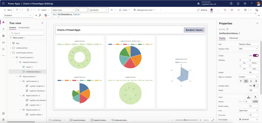
Microsoft Best Practices for Responsive Power Apps
Microsoft officially recommends the following responsive techniques:
1. Disable “Scale to Fit”
Allows layouts to respond naturally rather than stretching controls unnaturally.
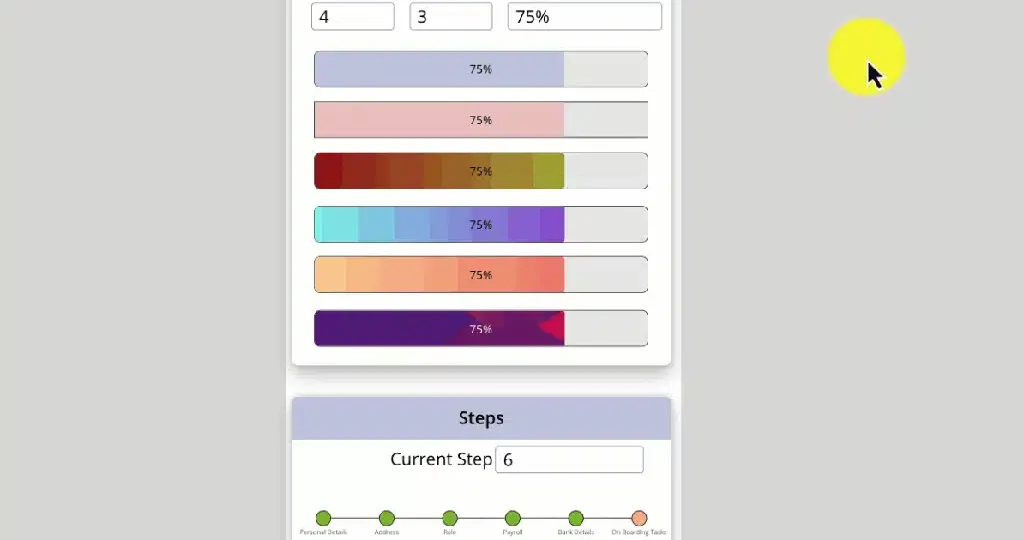
2. Use Containers Everywhere
-
Vertical containers for stacking
-
Horizontal containers for adaptive rows
Containers are the foundation of modern Power Apps UI design.
3. Apply Relative Sizing
Avoid fixed pixels. Use formulas like:
Width = Parent.Width * 0.8
4. Implement Breakpoints
Control layouts dynamically:
If(App.Width < 600, MobileLayout, DesktopLayout)
5. Test Across Devices
Use Power Apps preview for phone, tablet, and desktop to catch layout issues early.
Why Businesses Must Build for Multiple Devices
Modern users are device-agnostic. They expect apps to follow them not the other way around.
Responsive Power Apps ensure:
-
Consistent branding across all touchpoints
-
Operational efficiency for distributed teams
-
Lower development costs by avoiding duplicate builds
Microsoft highlights multi-device readiness as a key driver of low-code ROI at industry events like Build.
Real-World Results from Responsive Power Apps
Large enterprises have already proven the value:
-
IKEA Sweden improved customer booking workflows with mobile-friendly Power Apps
-
Equinor enabled field teams to access workflows seamlessly on tablets and desktops, reducing delays
These outcomes reinforce one fact: responsive design directly impacts productivity and user satisfaction.
Practical Steps to Build Responsive Apps Faster
If you are starting from scratch:
-
Begin with tablet layout for flexibility
-
Use nested containers for complex UI
-
Design for portrait and landscape
-
Hide non-essential elements on smaller screens
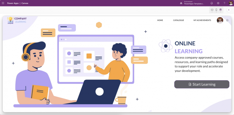
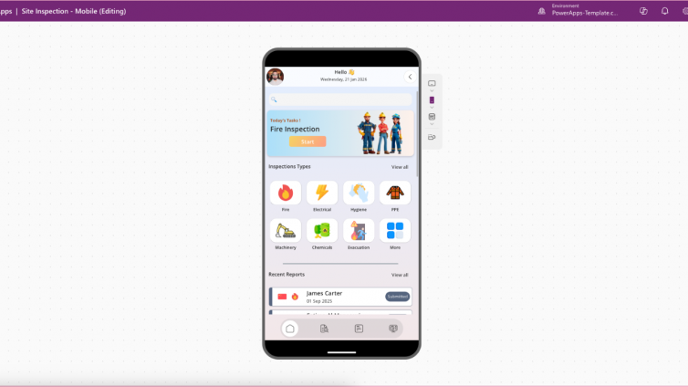
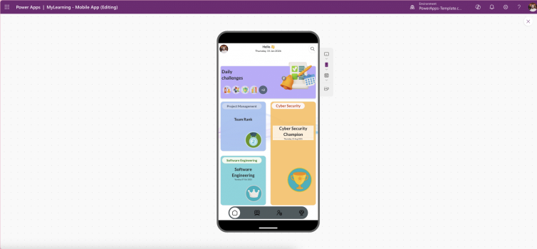
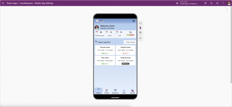
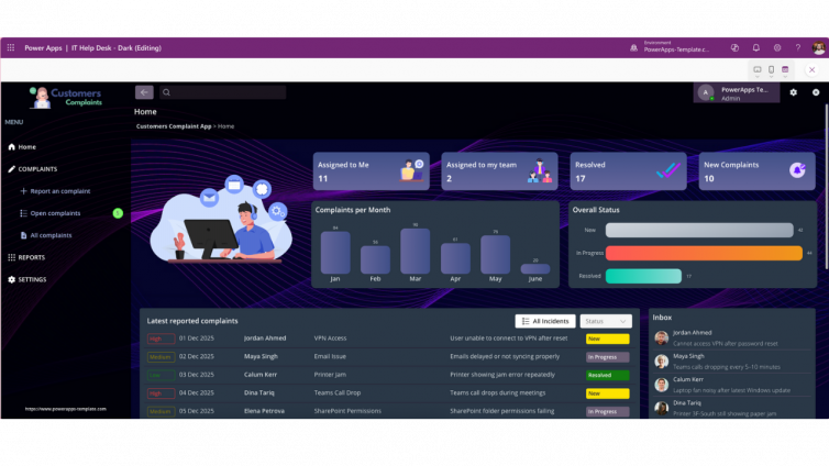
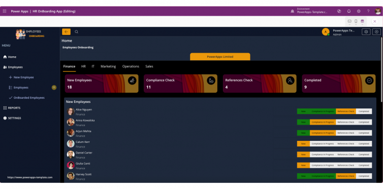
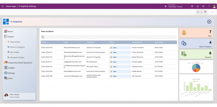
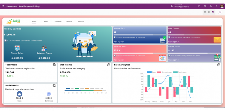
Or accelerate development by using professionally designed Power Apps templates that already follow Microsoft’s responsive standards.
